Autumn Composition by Tony Fitzpatrick
 Review by Kacie Krominga
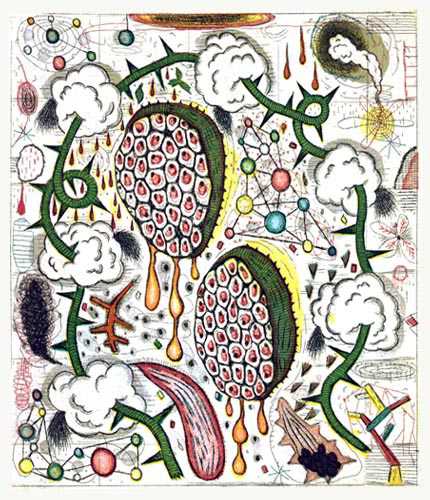
Five color etching with aquatint on German Etch paper
6” x 5”, 2001
Most likely done on a metal or glass plate, etching refers to creating an image on a plate with acid and then transferred onto paper, otherwise known as a form of printmaking. A lot of artists tend to do this process to create black and white images.
This image done by Fitzpatrick seems to have started off with creating an image in solely black, then color was added to it later.
The artwork information reveals that it was a five color etching, although at first glance, there appears to be six colors – blue, orange, pink, green, yellow and red; although the orange or pink was most likely used to make the reddish color in the image. Different shades of each color were used to create darker or lighter versions of the original color – especially with the pink and orange, there is more contrast with those two colors.
The image itself is more in juxtaposition to the title of the piece. “Autumn Composition” displays nothing of what one thinks when he or she thinks of Autumn. No rich oranges, reds, yellows or even browns are used in this piece. Instead the colors are bright and almost neon and in your face.
The green, thorny vine throughout the image is broken up by what seem to be clouds and give the image a dark undertone as opposed to what an image with such bright colors should portray. There are also a few sporadic bits of black that look like tiny tumbleweeds or tornadoes which also add to the dark undertone of the piece. The word composition means one of several things in the piece. Composition meaning a work of art, obviously, but it also means an arrangement of parts.
Three individual images within the piece appear to look like an atom or proton science fair project, where one can infer the “composition” of Autumn comes from. It may very well represent the composition of Autumn, but that still doesn’t explain the bright colors.
Some parts of the image seem to be melting or raining, which again, gives the image a sadder feeling even though the colors scream alive, happy and fun.
This image could represent what one feels during the transition of Summer to Winter. The bright colors represent the happiness of Summer, and the drips and black swirls represent the hatred of Winter coming. What is in between Summer and Winter? Autumn. Fitzpatrick just might have a hatred for Autumn, who knows.
The image as a whole is very surreal, confusing but interesting to look at. The bright colors draw the audience in, the focal point of the piece is in direct center but the green, thorny vine keeps the eye wandering to make one continue to look at the piece.
The rest of the piece is filled with small etchings that don’t really add anything to the piece except fill space.
No comments:
Post a Comment